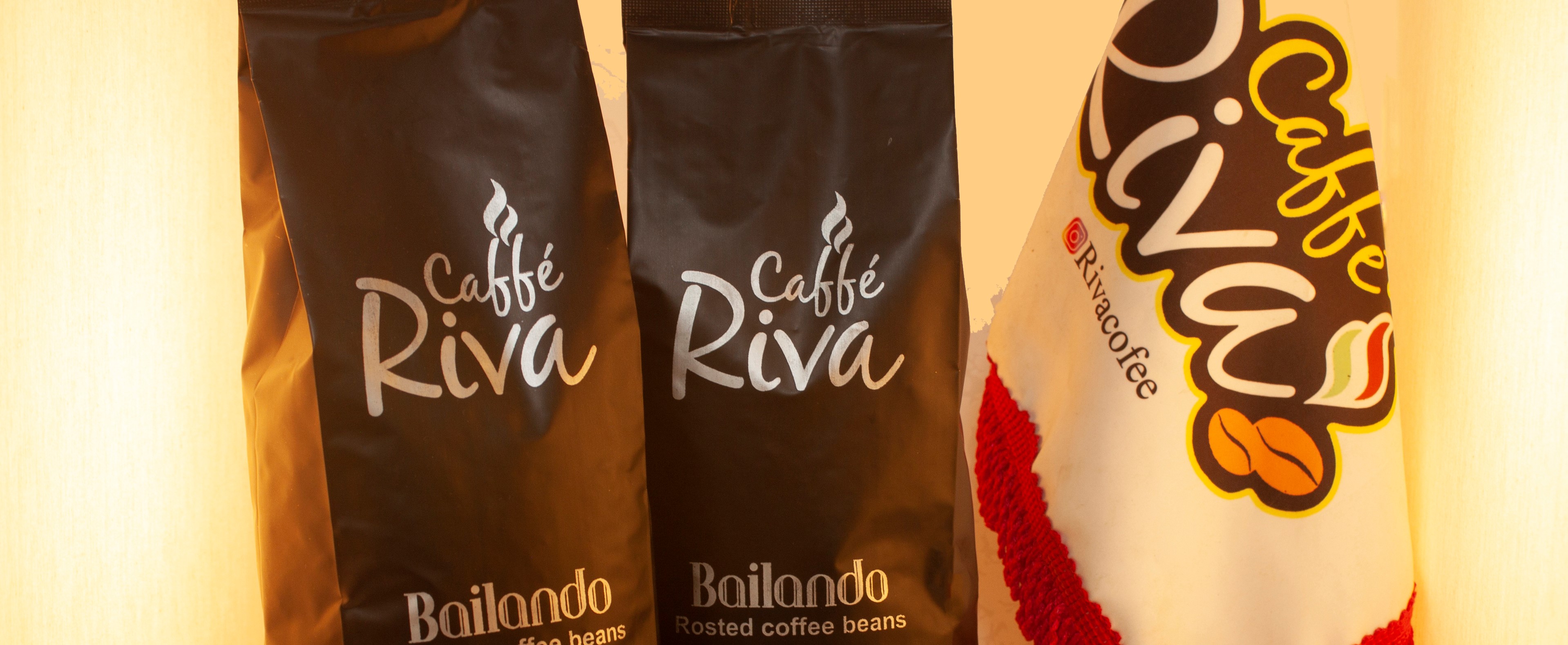
Throughout the past eight years, the Riva Coffee Complex has been physically active in Mashhad under the management of Mr. Efati. Riva has more to offer than just coffee.
Additionally, they have offered a number of other products and services in recent years, including selling industrial and home coffee machines, various accessories, repairing and setting up coffee shops throughout Iran.
As a result of the current market situation and the growing popularity of online shopping, the collection management decided to launch a website. We were glad to design the website for the Riva Collection.
As part of our interview, we asked how Riva was formed and how it got started.
The services and products that Riva has for sale were described to us.
In addition, the business objectives were reviewed with the employer.
According to the results of the survey, we discovered that users of our website drink coffee at least once a day and would be interested in making their own coffee.
Our site had to be designed so that users would feel comfortable shopping online as most people prefer to shop in-person.
In our design, we tried to pay attention to the users' needs and examine their expectations from Riva.
Our final discussion treated the most profitable products in order to determine which product generates the most profits for this business.

During our research, we found that the biggest challenge users face when shopping online is finding quality products.
In order to make purchasing easier for users, we decided to provide more detailed information about the products.
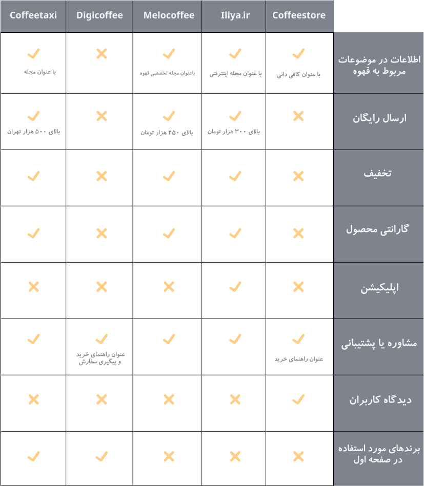
To learn more about the different features and processes of a few coffee stores' websites, we also conducted a complete comparative analysis.
This research is summarized in the table below.
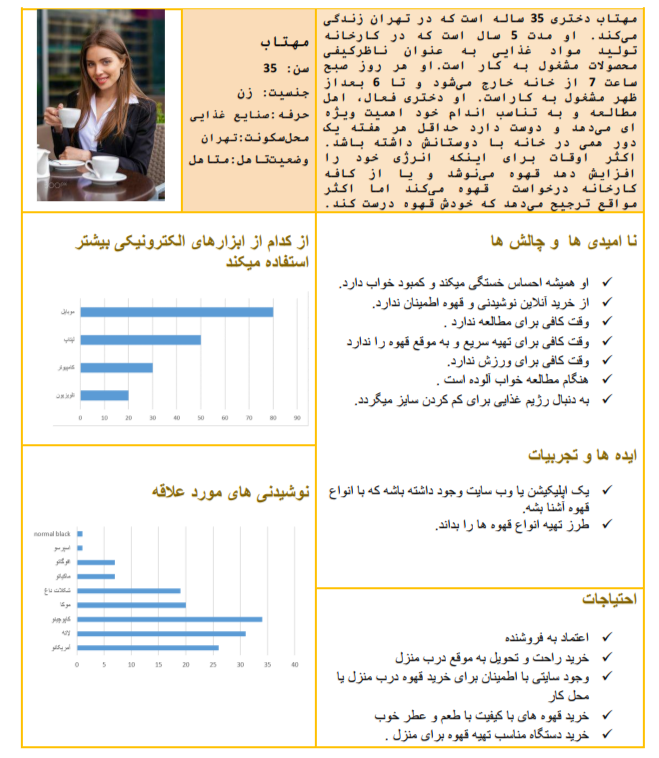
Personas are created based on the data collected during the discovery phase.
This will lead to a website designed to accommodate the needs and preferences of Mahtab.
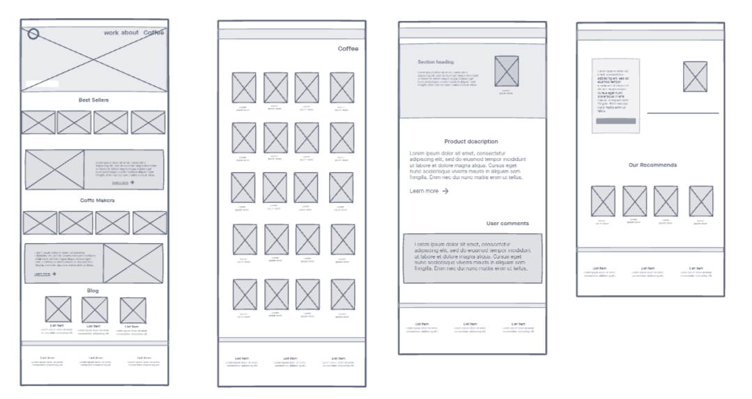
As I wanted to save time, I developed the digital wireframe first before doing much work on paper. I prefer to test limited prototypes on paper before committing to digital development when I have plenty of time.
A different design team created the logo.
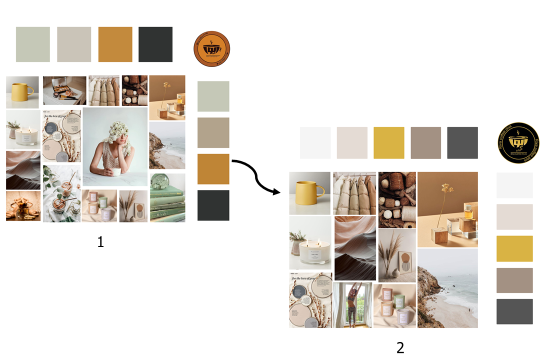
First, the client provided us with Figure 1's logo, then Figure 2's logo, and our moodboared was modified as pictured below.
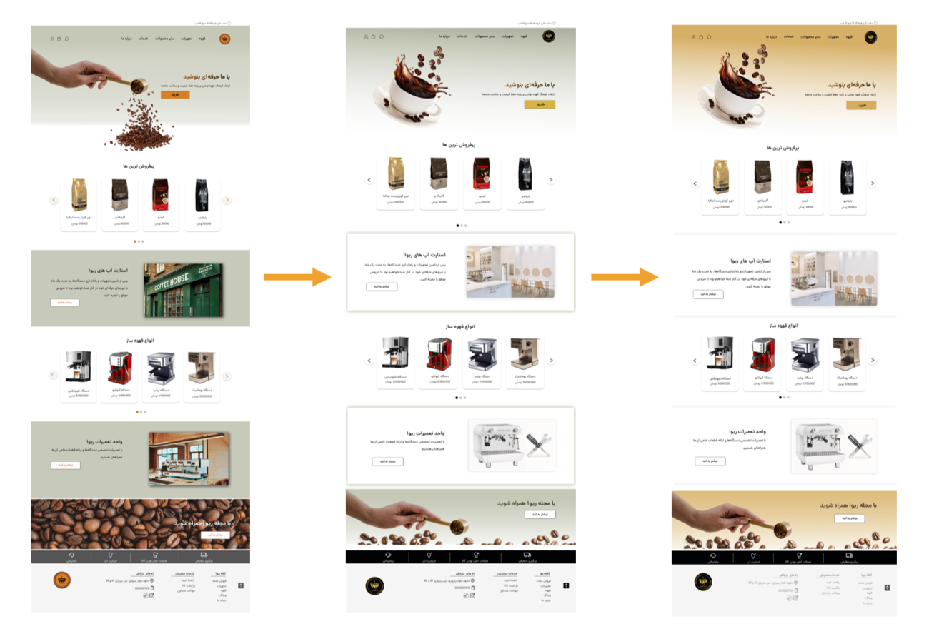
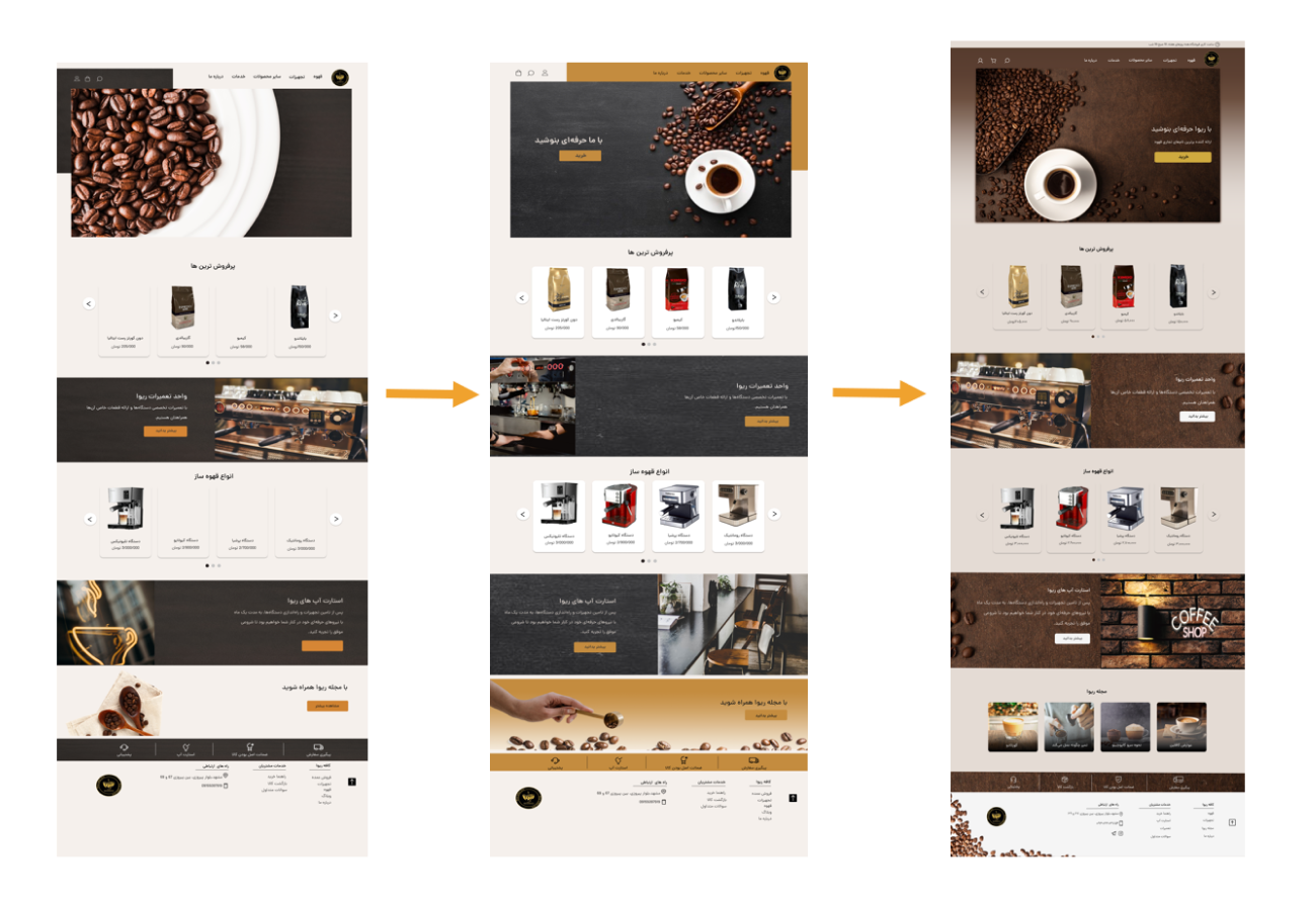
The prototypes were tested with potential end users and we chose the sample that made the purchase process quicker and easier for the user.