
Where is Panbeh bookstore?
PanBeh is an Iranian online bookstore in Canada that can ship books to the United States and Europe.
For Persian speakers outside Iran, it is a good place to browse Persian books
The process of redesign
Review of the PanBeh website
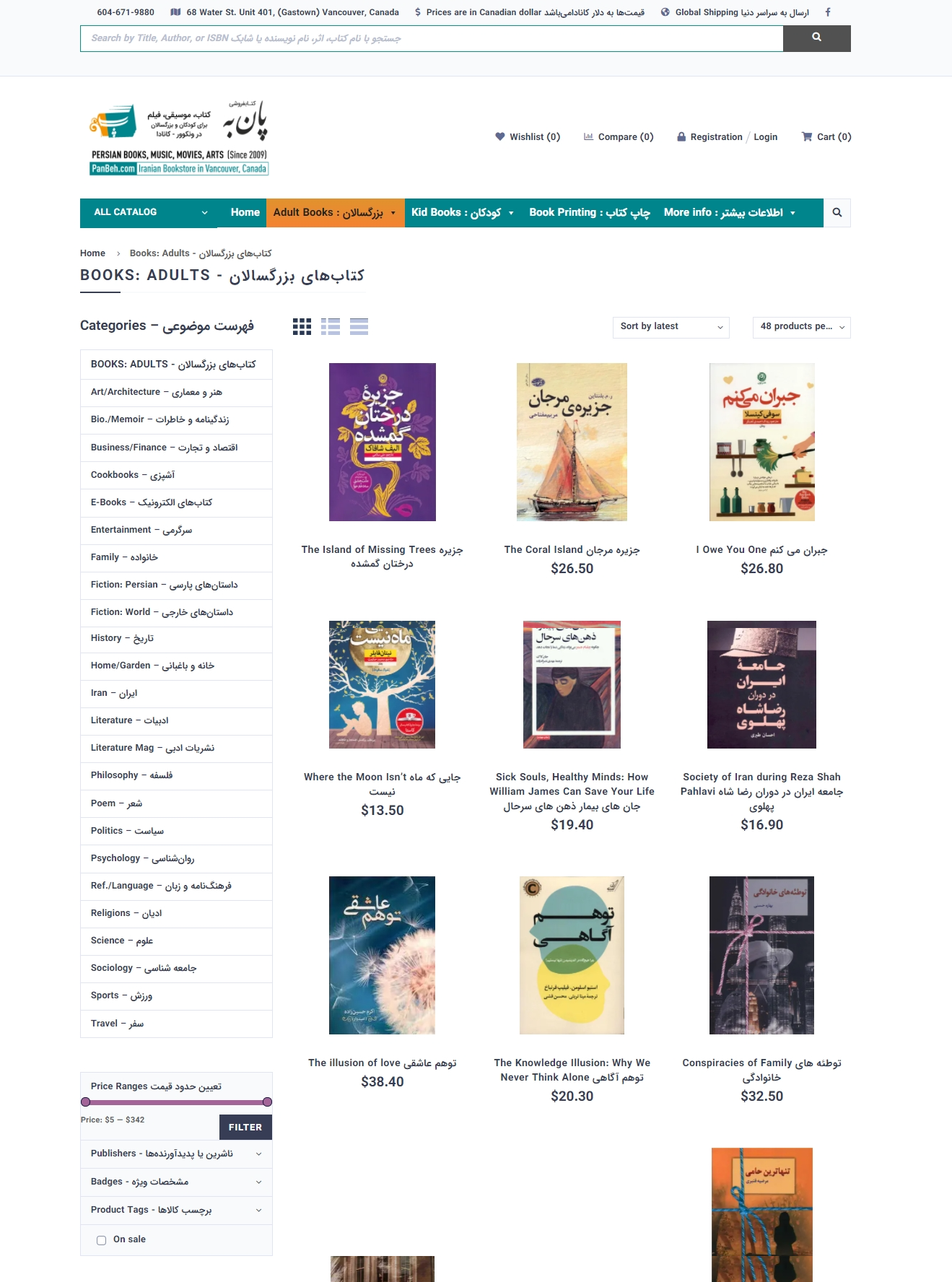
The cluttered pages and lack of visual effects caught my attention on my first visit to the website. It was difficult to read the pages due to their crowded nature.
On the home screen, the menus were duplicated horizontally and vertically.
My goal with the design was to simplify the site, make categories clearer, and make the site easier to access.
Below is an example of the website before it was designed:
User interview
The existing site was provided to users and they were asked to purchase books through it.
During the purchase, they faced the following challenges and demands:
- An unorganized and crowded site
- Lack of visual effects
- Ordering nonexistent books
- Take a look at other people's opinions
- A brief summary of the book would be helpful
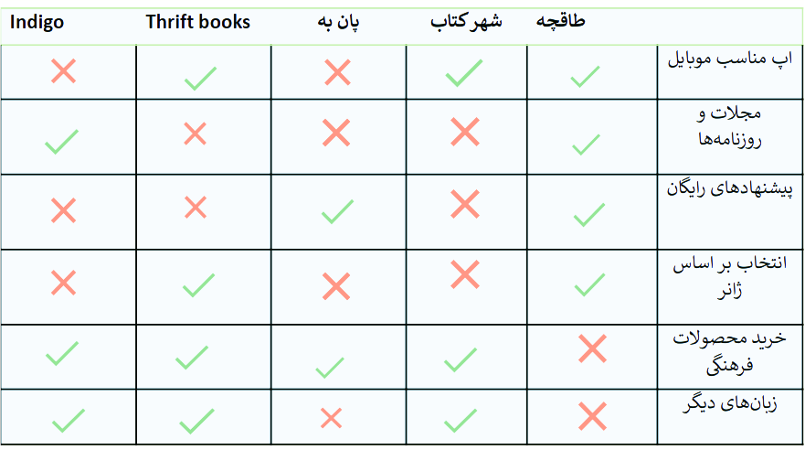
Comparative analysis
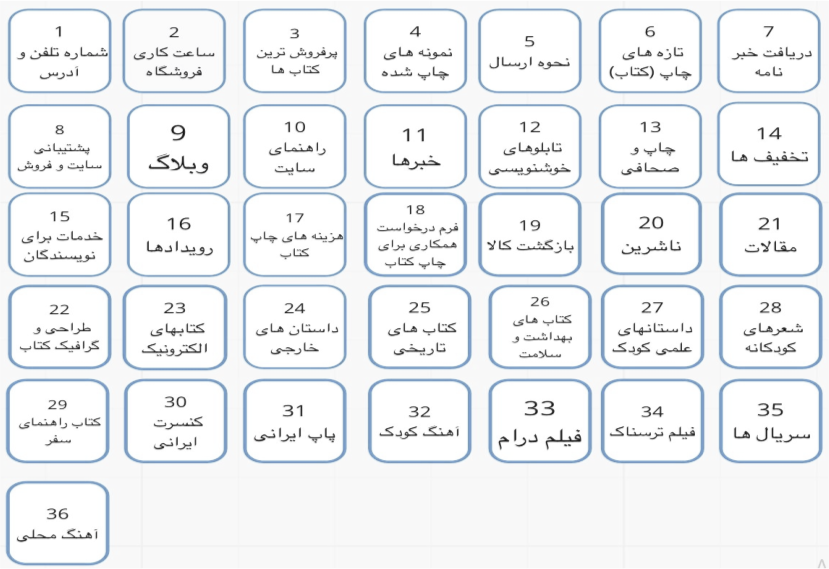
Sorting card
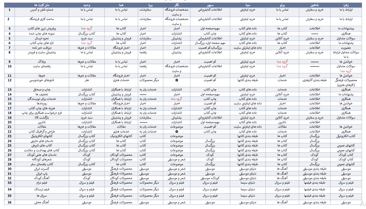
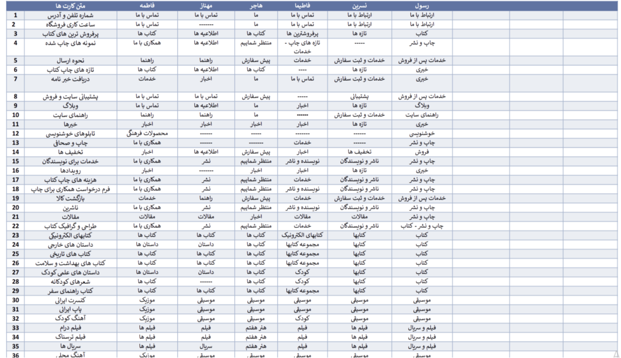
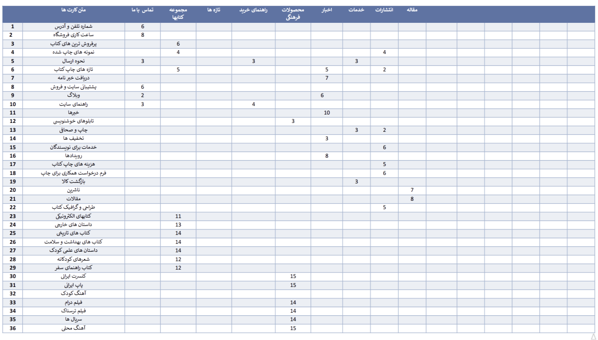
Considering the content of the site, the business goals, and the analysis of similar sites, we finally reached 36 cards and had 15 people sort them out.
The following tables demonstrate the sorting card process:
Site map

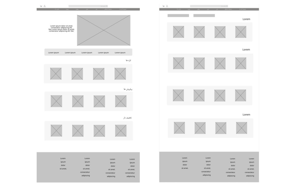
Digital wireframe
As I wanted to save time, I developed the digital wireframe first before doing much work on paper. I prefer to test limited prototypes on paper before committing to digital development when I have plenty of time.
Prototype
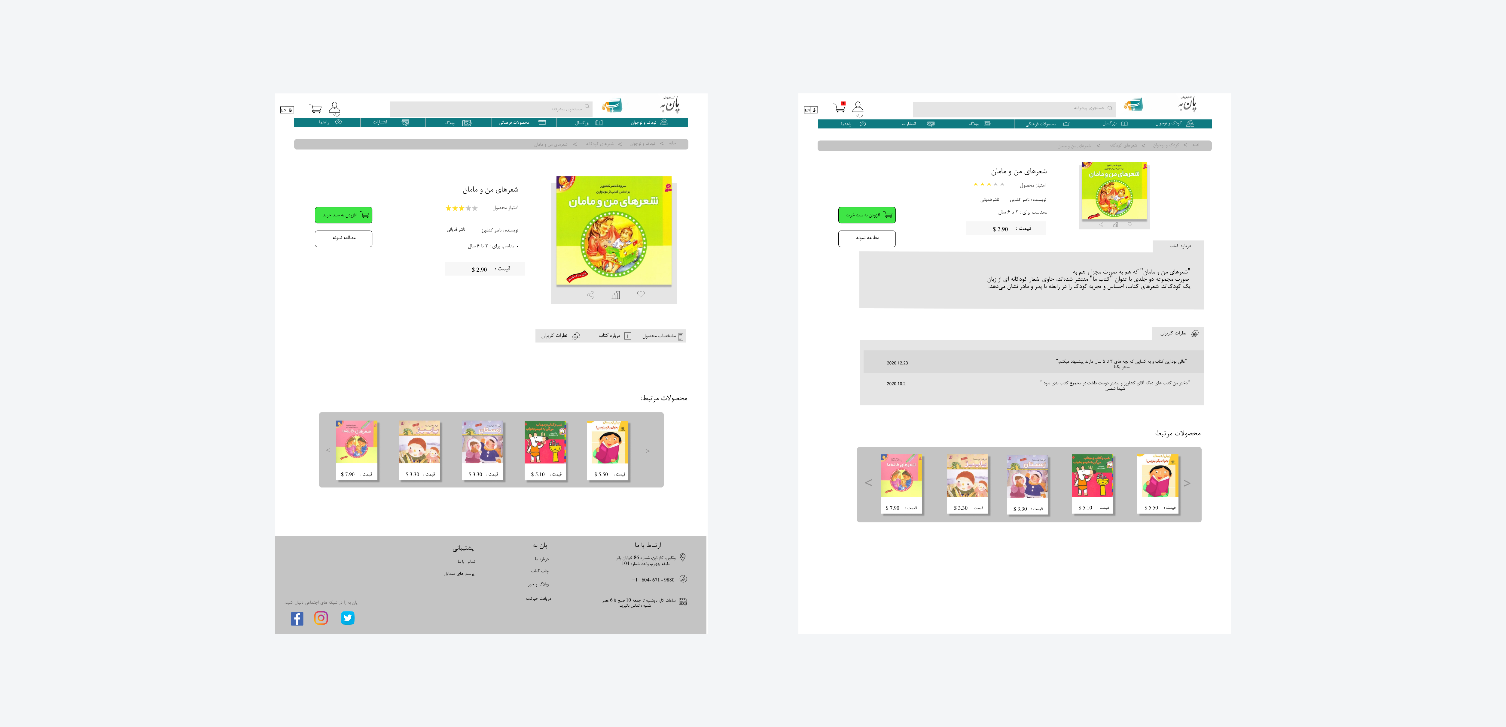
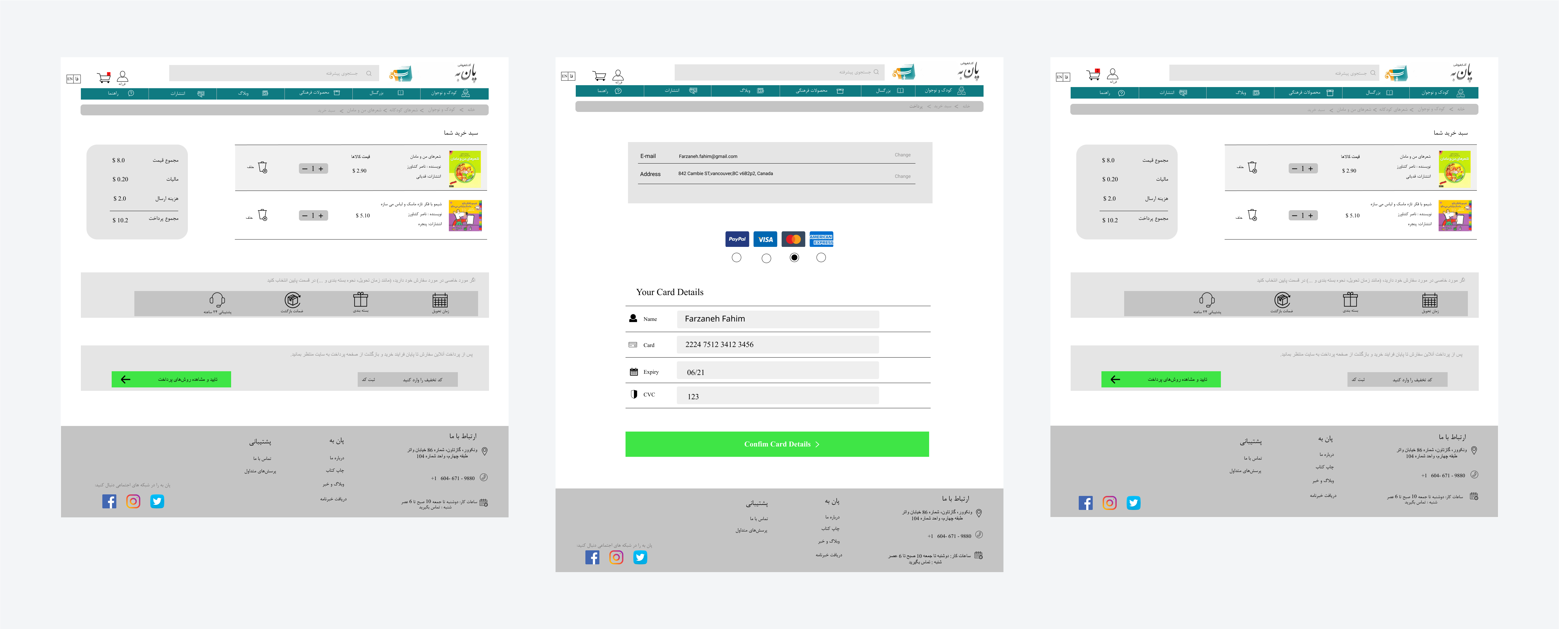
A/B testing
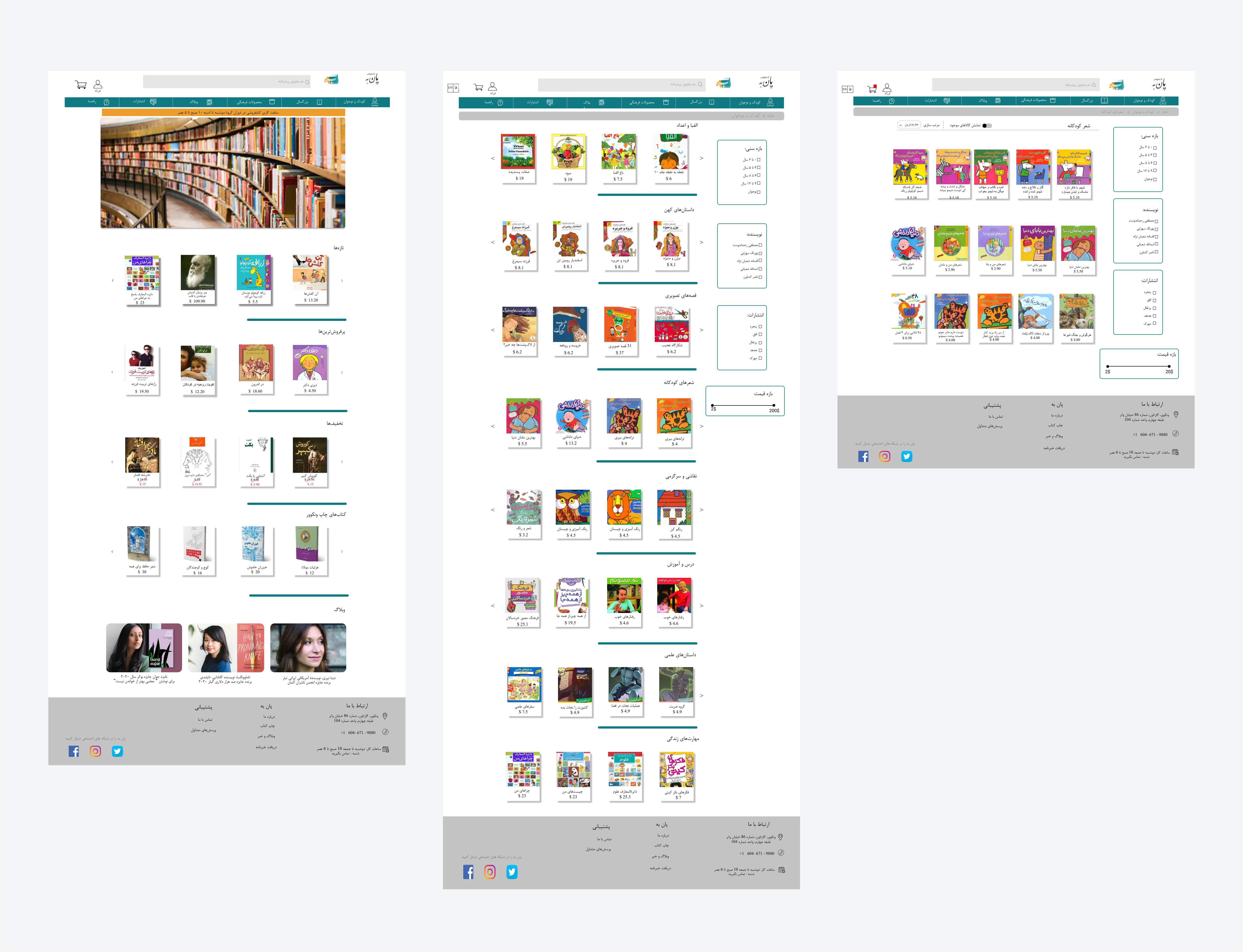
After testing the prototype with potential users, we applied the best ideas according to the project goals as much as we could
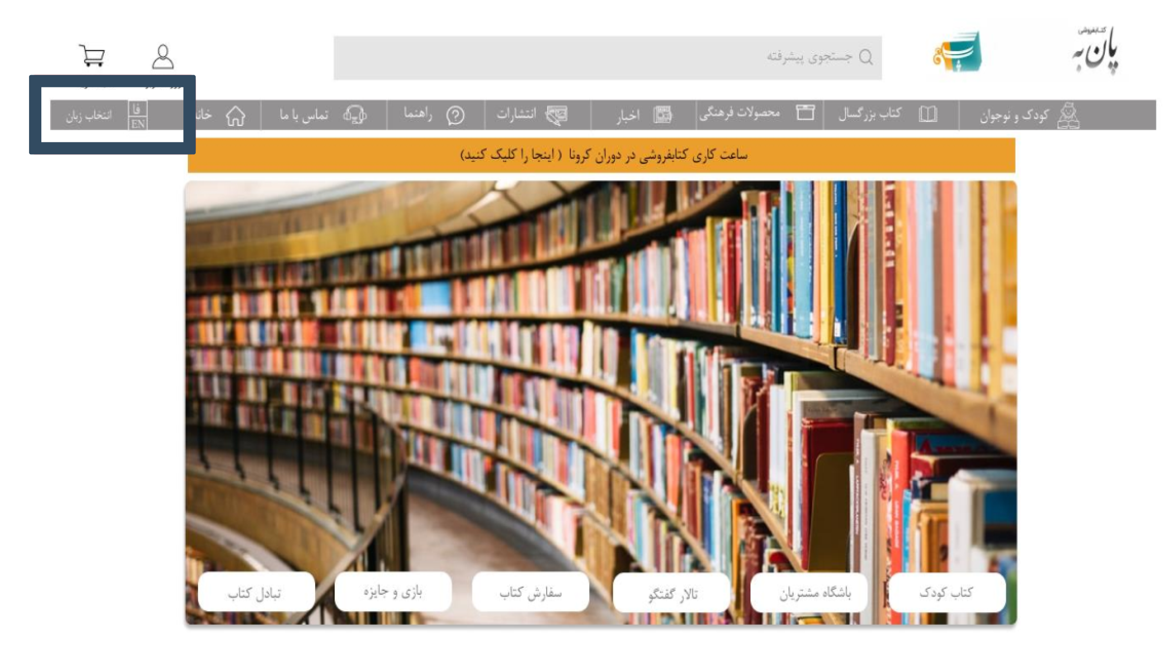
Due to a lot of comments about the site being in English and the fact that the majority of users prefer Persian, we decided to launch in two languages and allow the user to select the language that they prefer:
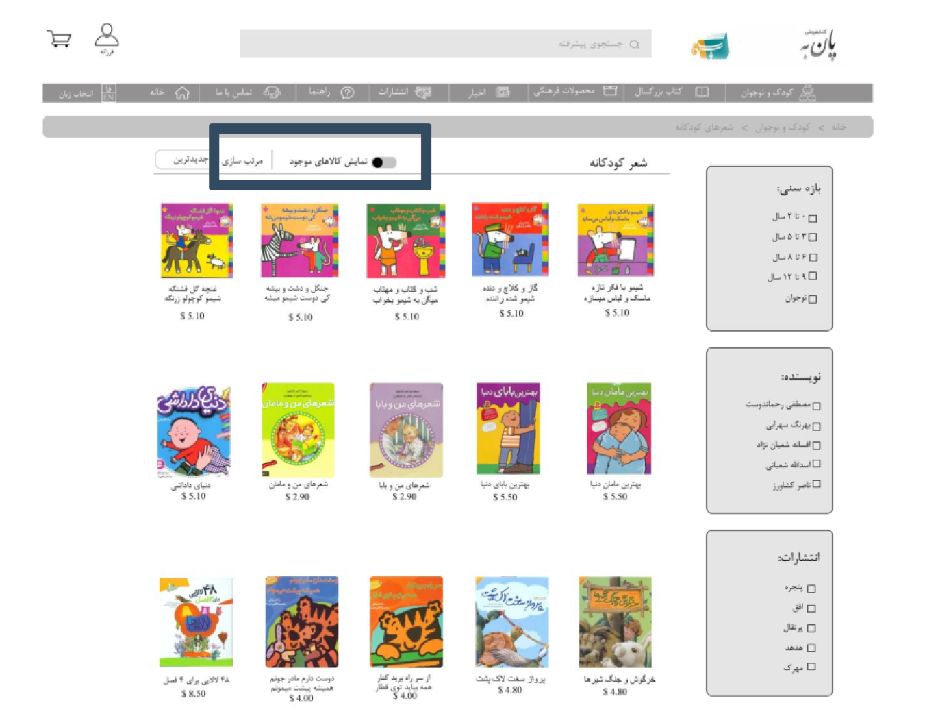
The comments we received from users led us to the conclusion that it is better to add a button that allows the user to choose only the goods that are available:
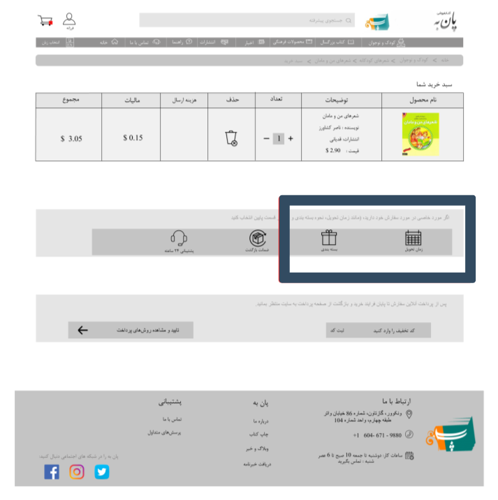
Customers asked us for a delivery time estimate. In addition, if the purchase is for a gift, it must be properly packaged:
Final prototype
You can click here to check the Digital prototype.